Use the data labels options to show or hide data labels, including total labels on stacked charts. You can also customize the fonts, colors, formats, and so on of both data labels and total labels as needed.
The Data Labels options are enabled for all Column charts, Bar charts, Line charts, Area charts, Segment charts, Radar charts, Plotted charts, and Advanced charts (excluding Word Clouds). Shape Maps also support Data Labeling; for more information, see Map Labels.
Formatting Data Labels
To show or hide Data Labels on your Visual, either use the Data Labels button on the Component ribbon or select the Data Labels option in the Formatting panel. To change the position, style, content, and other formatting options for your Data Labels, use the Formatting panel.
Tip: By default, the Data Label is the measure of the actual data point. You can, alternatively, use the Labels drop zone to label the chart with a different measure. For more information, see Labels Drop Zone.
Component Ribbon
Toggle data labels on and off using the Data Labels button on the Component ribbon:

Formatting Panel

Show Data Labels
Data labels are disabled by default. Turn data labels on, using one of the following options:
- Select the Data Labels checkbox at the top of the Formatting panel (purple arrow above).
- Click the Data Labels button in the Component ribbon.
Position the Labels
Pyramid positions the data labels on or alongside the segments of your diagram according to your Position and Label Optimization selections, and the size and available space for your data labels on the visualization. For more information, see Data Label Optimization.
From the Position drop-down (green highlight above), choose where to position the data labels:
- Optimized: Allows Pyramid to automatically select the position of your Data Labels. Pyramid tries to place each Data Label either inside or outside of the segment, depending on the space available and your selected Label Optimization options.
- For segment charts and scatter charts:
- Inside: Place data labels inside the chart segments.
- For column charts only:
- Inside Top: Place data labels inside each column at the top.
- Inside Middle: Place data labels inside each column in the middle.
- Inside Bottom: Place data labels inside each column at the bottom.
- For bar charts only:
- Inside End: Place data labels inside each bar at its end.
- Inside Middle: Place data labels inside each bar in the middle.
- Inside Start: Place data labels inside each bar at its start.
- Outside: Place data labels outside the chart segments.
Label Optimization
- Optimize Outside Labels: Appears when position is set to Optimized or Outside for segment charts only. Select this option to reposition labels that are outside of the visualization segments, so that the maximum number of labels are shown on the visualization.
- Allow Labels Overlap: Show labels even if they overlap with each other.
- Overlap Tolerance: Where labels overlap, only show those labels where the "collision percentage" (overlap) is below the selected tolerance. For example, if this value is 50, only labels that overlap other labels by less than 50% are shown.
Label Font
Adjust font type, size, and style for your data labels (blue highlight above).
- Font: Change the font type.
- Size: Change the font size.
- Style: Change the font style (bold, italics, or font color, which is changed using the Color Picker).
- Background Color: Change the background color using the Color Picker.
Content
Adjust the content of the data labels (yellow highlight above). By default, data labels show the numeric value of each segment, but you can add more information to the labels.
- Value: Set the units for the data labels. Choose Auto to let Pyramid set the units, or select thousands, millions, or billions. Choose Off if you don't want to display units.
- Series: Add the data series to the label (this will correspond to the legend).
- Category: Add the hierarchy category to the label (this will correspond to the categories on the x-axis).
- Percentage: When working with segment charts and stacked 100% column charts, this option will be enabled instead of Category. Use it to show the segment value as a percentage of the total.
- Add Line Break: Display each selected data label content type on a new line.
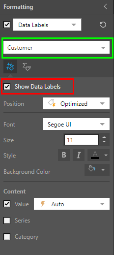
Select the Data Series
If the report features a legend driven by a hierarchy in the color drop zone, a data series drop-down is shown (orange arrow above). Your selection from this drop-down indicates where the formatting changes apply:
- Select Default to apply your formatting changes to every series in the report.
- Select the name of a single series to apply your formatting changes that given series only.
You can show or hide data labels for the selected series (red highlight below), and apply any formatting changes as required.
You can further edit each data series using the color formatting capabilities (when selecting Color from the Formatting panel drop-down).
Data Labels for Stacked Charts
Where your chart is "stacked":
- You can show a data label on each segment of the stacked column or bar in your chart.
- You can show a single overall total for each column or bar.
- You can show labels for both the stacked segments and the column or bar total.
Note: This functionality is available for: Stacked Column Charts, Stacked 100% Column Charts, Marimekko Charts, Stacked Bar Charts, and Stacked 100% Bar Charts.
Total Labels for stacked charts
While the segment data labels are formatted using the Label Font fields described above, the Total fonts are independently formatted using the options on the Total Labels tab. For more information, see Total Labels in Discover Pro.
Examples
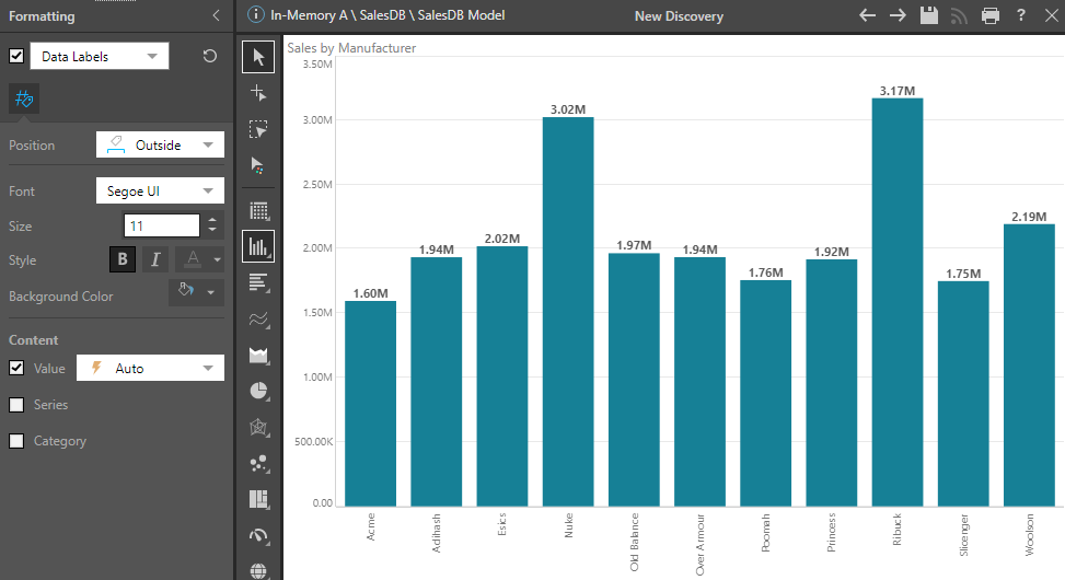
In this example, data labels are positioned outside of the bars and use bold text:
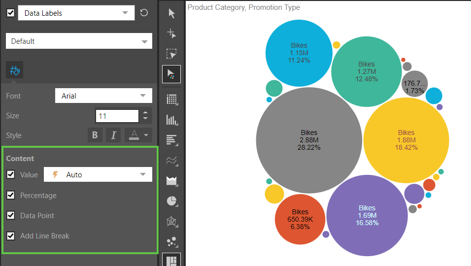
In this example, the value, percentage, and data point are displayed in the data labels with a line break between each label:
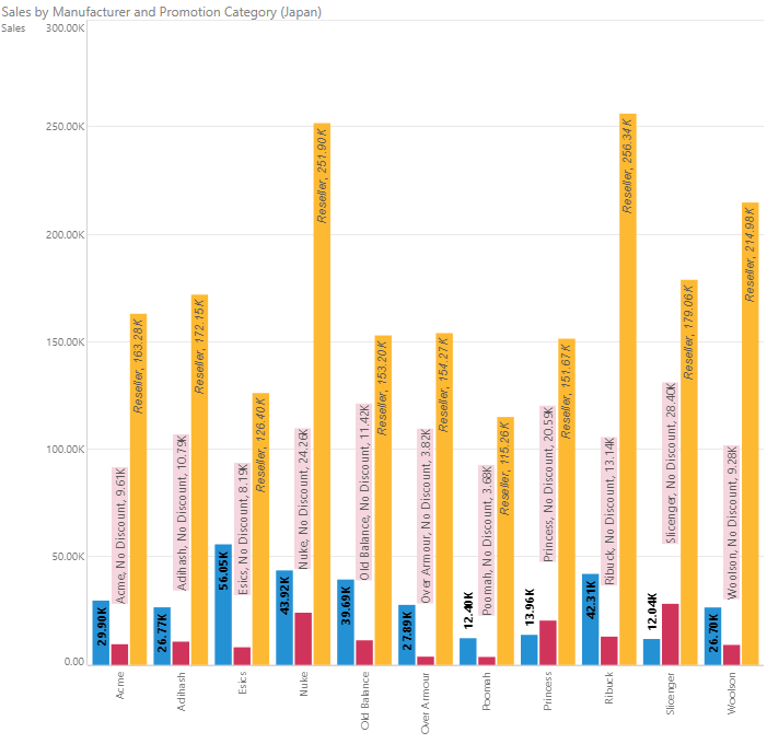
Here, the data labels were formatted differently for each data series. For Customer (in blue) the labels were simply set to bold. For No Discount (in red), the labels were placed outside, with a background color applied, and both series and category were enabled. For Reseller (in yellow) the labels were placed at the top and italicized, and the series label was enabled.
In this example, both data labels (purple arrows below) and total labels (green arrows below) were added to the stacked column chart to display the value for each segment and the total value of each column:

For more information about Total Data Labels, see Total Labels in Discover Pro.